Nigel Slater understands. In Eating for England he says:
‘How we eat our golden round is distinctly personal. Thick or thin, crisp or soft, gold or brown or black or a bit of all three – and then there is the question of crusts and their retention or removal (it’s a minefield I tell you).’
I’m very particular about toast. Just ask my husband. I’ve turned my nose up at more than a few of his attempts to make my breakfast favourite. Wildly ungrateful of me, I know, but toast is serious stuff.
I like mine lightly done and pale gold in colour. While it gently browns, the maker must hover millimeters from the toaster with knife poised, ready to pounce. Speed is essential as I can’t bear unmelted butter on my bread. Each slice must be stacked meticulously atop the other to ensure optimum distribution of heat throughout. I like it best when the bread softens a little beneath it’s unctuous topping. Honey is my favourite, but I’m not adverse to a little marmite now and then.
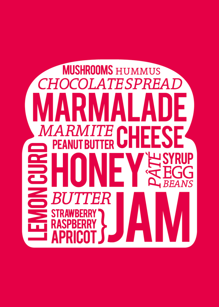
I’ve had my eye on the Toast Print in red by Showler & Showler ever since I spied it on The Yvestown Blog. It’s what my new kitchen walls are crying out for.
Love Audrey xxx


This post has made me remember my third year at university. I lived on about £40 a week, covering food, bills, travel and socialising. Needless to say I always made sure I’d enough for Wednesday nights in the SU. Tesco value bread was 9p a loaf and I would dine on toast daily. Some of my topping included- peanut butter, salad cream, chef’s sauce and marmite.im shaking my head as I type. However, it’s very hard to beat a decent slice of toast! I also like it golden brown and wholeheartedly agree with the speed element.
It’s a cute print. How exciting for you to be planning your new decor in a new home. Enjoy x